Among the many joys homeowners experience when decorating a new residence is the ability to put into context�and sometimes even into words�their own unique lifestyle. Eric and Kerry Cole turned to interior designer Alice Busch of Great Falls Distinctive Interiors to help them realize a way of living Busch termed �casual opulence� in their new Ashburn, Virginia, home.

LUXURY INTERIOR DESIGN
�They were very clear about the generalities of what they wanted,� Busch says of the Coles, who envisioned their new home in the Belmont Country Club enclave as a haven that, while luxurious, could still support the day-to-day energy of their three young children. �She loved the richness and comfort of a Ralph Lauren look, and he wanted something more impressive and opulent. So we had to meet in the middle,� Busch says.
Kerry Cole agrees. �My husband is very Versace. But I�m home with the kids and wanted something that, while beautiful, would be really comfortable,� she says.
The end result is an amalgam of easy elegance. Grounded in rich woods and sparkling with jewel-toned fabrics, the rooms are beautiful but appointed to stand the test of time�one of Busch�s signature decorating mandates. �We had to take special care with the durability and quality of the materials we used. Most of the carpets and rugs have patterns and are very child-proof,� she says.
One such rug presides in the dining room, which, like the many fine meals the Coles enjoy there, is a sensual delight. A grand table imported from Italy is surrounded by chairs with distressed wood frames and nailhead trim. Busch selected deep burgundy upholstery on the chair fronts, while the backs are covered in neutral suede. Shadowy, heavily textured walls reveal a stencil pattern that complements the detail in the damask drapes. �Even though it has a rich and elegant feel, the room still looks worn,� Busch says. �The opulence in this room is in the fabrics, and the walls are made to look very old.�
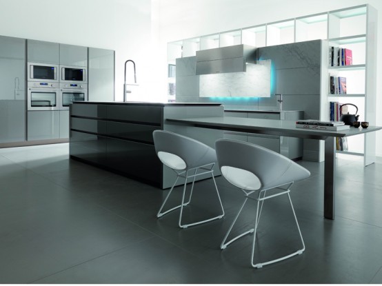
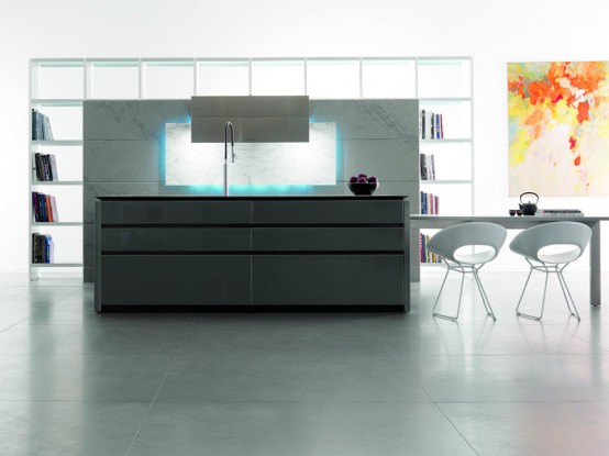
In the kitchen, which initially had been earmarked for dark cherry cabinetry, Busch opted instead to lighten things up with white cabinets and a central cherry-based island that dovetails nicely with the wood furniture in the adjacent breakfast room. Dusty red toile wallpaper and pencil pleat balloon valances in a Scalamandr� plaid also help to relate the two spaces. �The kitchen adds the lighter element,�
Busch says. �We had to integrate this very large space so instead of doing it with a deep tone of color we did it in other ways. It�s cheerful and open, a little country but tastefully so.�
The nearby great room, where the family congregates casually, is awash in saturated neutrals and golds that create a warm and cozy atmosphere with just the slightest nod to the outdoors. (A new tiered stone terrace off the room is planned). As well as housing loads of closed storage for children�s toys, the room accommodates two custom sofas which are so deep, Busch says, without their back cushions they�re the depth of a twin bed. More formal gatherings are staged in the conservatory. In this room that Busch describes as �sophisticated without being ostentatious,� a grand piano is offset by a gracious seating area.
Upstairs, Busch also created a sweet bedroom for the Cole girls with room to grow, with two beds adorned with hand-carved birds and a continuous, wall-long valance that sweeps over not only the windows but also canopies the beds.
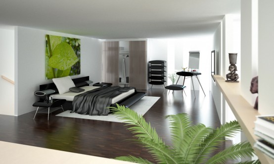
For the master suite, Eric Cole had a clear mandate. �He travels a lot and wanted everything at the level of some of the wonderful five-star hotels he stays at,� Busch says. She achieved that aura with a mix of calming sea shades, a soft-patterned rug and an eye-grabbing sunburst canopy bed whose romanticism the Coles �simply couldn�t resist,� she says. The room also has a spacious sitting area with a secretary where Kerry Cole attends to her correspondence, a working fireplace, two sumptuous club chairs, and even a full breakfast bar and table�another nod to luxurious hotel suite living. �We used striae on the walls to add complexity and visual interest,� Busch notes, �and it really helps pull out the background panels behind the bed and the pillows.�
Aside from helping the Coles realize their dream home, Busch was able to complete the task in less than four months�a feat made even more remarkable since the couple did not contact her until well after the building process was set in motion.
 In these days working from home is becoming a trend thanks to the internet. For those of you who work from home, or want to have a quiet place to work the OfficePOD provides a new additional space that is dedicated to work only. This creates a very important mental and physical boundary between home and work. The Office POD brings a whole new meaning to the idea of remote working as it comprises a rather sleek workspace in an all inclusive capsule. The OfficePOD is of optimum size (2.1m x 2.1m) and does not require planning consent in the greater majority of cases. It�s modular design enables speedy construction even in gardens with the most difficult access. The POD has been designed to provide appropriate security when empty or occupied. The external and internal look and feel of the space as well as the overall user experience is the product of an extensive design process.

